For the last several decades, the graphics decorating Starbucks’ packaging have been driven by the stories behind its coffee, focusing on where the blends come from and what they stand for. In the first redesign of the bag graphics for its core whole-bean coffee line in 10 years, the multinational coffeehouse chain and roastery has taken storytelling to a new level, with designs that “thoughtfully translate the people, moments, and experiences associated with each blend into art.” The full-body graphics are so gorgeously rendered, in fact, Starbucks has made the art available for download for use as computer wallpaper.
The progression of Starbucks’ packaging from 1971 to today, from a waxed paper bag with a black rubber stamp designating its contents to a luxuriously printed, arresting piece of artwork, has been one that has mirrored the company’s evolution. When Starbucks first opened its doors over a half-century ago as a retailer of whole-bean coffee, its goal was simple: to bring delicious dark-roasted coffee to Seattle. Hence, its packaging was equally simple, with the beans scooped by hand into the minimally decorated bags.
 | Watch this video on five disruptive packaging design trends for 2021/2022 from Pentawards. |
As the brand transformed into an Italian-style coffeehouse, it began thinking about its packaging in a different way, and its bags “became vessels for visual storytelling,” it shares. In 1987, it began affixing colorful stamps to its paper bags that provided playful representations of what was inside each bag: A tiger stood for the Sumatra blend, Yukon Blend got a fishing boat, and Caffé Verona got a rose, to name a few.
In 1995, Starbucks introduced its first coffee sold in packaging printed with colorful graphics, Blue Note Blend. Says the company, “These new ‘rollstock’ packages weren’t just eye-catching—they offered us a larger canvas for sharing each coffee’s unique story through images and words.” The packaging that followed often incorporated the stamp designs, echoing the old-school stickers, until 2011, when the Starbucks logo and brand identity were updated.
Although Starbucks’ use of the stamps faded away as its packaging designs became more complex, hints of that original art can still be found in the most recent bag graphics, paying homage to the brand’s history in a new and more sophisticated context.
Design strategy starts with the coffee
Starbucks employs a talented team of eight designers and illustrators in-house who are responsible for its branding and packaging design. Even for these talented professionals, however, “designing a new core coffee bag can be a daunting task,” says Starbucks. “Unlike seasonal coffees, such as Starbucks Christmas blend, or even holiday cups, core coffee packaging does not change every year. In fact, the design is intended to last at least 10 years.”
To fully understand how the refreshed graphics might convey the stories of the beans inside, Starbucks Creative Studio enlisted Starbucks Coffee Team’s coffee/tea development lead, Sergio Alvarez, to share with them the stories behind the beans—starting with tasting notes and descriptive words to highlight the flavors of each unique coffee blend.
 | Read related story on unique new package designs for several coffee brands. |
“We have a very unique and thoughtful way we develop coffee blends at Starbucks, and we wanted to make sure that came through in how we describe them,” Alvarez says. “Depending on the blend, depending on the roast, and depending on the regions, there are different flavors that we associate with each of these special coffees.”
Alvarez and the Coffee Team also shared the history of many of Starbucks’ most beloved blends to inspire the designers. Organic Yukon Blend, for example, was created in 1971 after a customer requested a coffee that would help keep his fishermen going during the fishing season in the Bering Sea. In the newest packaging for that blend, the same independent spirit of Alaska is evoked, with a mountainous scene set in the Yukon valley.
Thoughtfully constructed and consistent architecture
The challenge for the Creative Studio team was to translate these stories and coffee characteristics into art, weaving together the past, present, and future while tapping into Starbucks’ new creative brand expression. Among the most prominent elements of the new bag designs are the hand-drawn illustrations, the colors, the terminology describing the flavors, and the consistent architecture.
When it comes to graphics for its packaging, Derek Shimizu, associate creative director for the Creative Studio, shares that Starbucks’ legacy has been to use hand-done illustrations to bring warmth and brand connection. “We wanted to continue to tie a thread to our new packaging,” he says. “We also wanted to make sure we were staying modern while looking forward into our brand.”
In reimagining the graphics, illustrators started with iconography and motifs that recalled past designs. For example, incorporated into the artwork for Starbucks Veranda Blend is the graceful hummingbird image used in previous packaging iterations; in the Sumatra blend, tigers can be seen stalking rainforest foliage. The illustrators also worked to incorporate coffee cherries and botanicals into the designs to highlight the origins of the coffee.
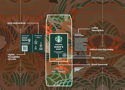 The new designs all follow a consistent architecture, with the hand-drawn illustrations for each blend used as a background, and a badge or color block, on the front and back panels of the bag providing details for each variety.
On the front panel, the badge system provides details that clearly identify the roast and tasting notes. To emphasize the unique characteristics of each blend, the Creative Team used more descriptive and culinary terms to describe the flavor notes than found on the previous packaging. For example, Veranda Blend was updated from “mellow and soft” to “toasted malt and milk chocolate,” and Italian Roast went from “roasty and sweet” to “dark cocoa and toasted marshmallow.”
Identifying the roast intensity is a bar of color at the bottom of the badge that uses a palette of gold, copper, and purple, established when Starbucks refreshed its packaging in 2011. The new designs use this visual cue to identify Blonde (gold), Medium (copper), and Dark (purple) roasts.
The new architecture also brings the ethical sourcing stamp to the front panel to underscore Starbucks’ commitment to positively impacting the lives and livelihoods of coffee farmers and their communities. On the back of panel of the bag is a QR code that can connect customers in the U.S. and Canada to where the coffee is grown using the Starbucks Digital Traceability tool. Also on the back panel are brewing instructions.
What follows are descriptions of each of the five whole-bean blends and the strategy behind the refreshed packaging artwork for each, provided by Starbucks.
Veranda Blend
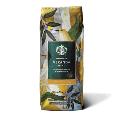
“This art is intended to transport customers to a lively veranda in Latin America, giving a tangible sense of the coffee’s origin,” says Yumi Reid, Starbucks designer and illustrator. “We wanted the design to reflect Starbucks Blonde Roast story through use of color: roast color is primary, supported by house green on the hummingbirds. Bright accent colors on foliage further highlight this amazing coffee’s story.”
Pike Place Roast
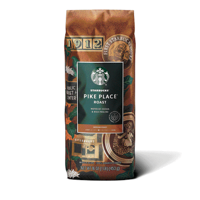
“In undertaking this design, we sought to leverage recognizable design elements and our brand’s history at Pike Place. To accomplish this, I utilized motifs from our heritage in a style reminiscent of travel luggage stickers and badges,” says Bridget Shilling, Starbucks designer and illustrator. “While the bag celebrates our history, I wanted to ensure the design is still grounded in coffee, so coffee plants are interspersed throughout. We use printing processes to ensure the copper hues will come to life for a warm, metallic effect.”
Single-Origin Sumatra
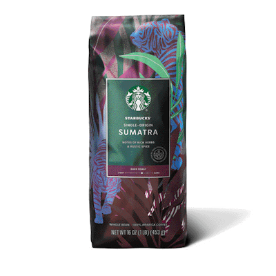
“I created an interesting effect by adjusting the scale of the tiger in relation to the palm trees and jungle landscape, noting the similarities between shapes of the tiger and palm leaves,” McCartin says. “Layering them adds an element of fun and mystery; you definitely see the tiger stripes at first glance, but once you look closer you find more.”
Single-Origin Guatemala Antigua
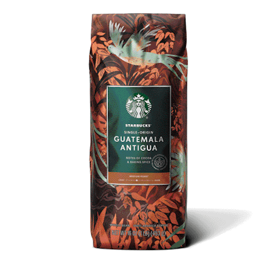
This coffee’s heritage is featured through the quetzal bird amidst plant life from the Antigua region. Starbucks designers updated the illustration style to be artful and sophisticated, using layers of texture and delicate linework to create depth and detail throughout the design. The colors are shifted to warm coppery tones, speaking to the coffee’s roast and lending a beautiful shimmer.
Caffé Verona
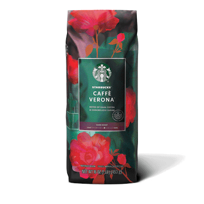
“Named after the city where Romeo and Juliet takes place, we wanted this dark roast to feel romantic and reference the ornate architecture,” says designer and illustrator McCartin. “Layered with our iconic Verona roses, you find a bubbling fountain, ivy draping off balconies, and Italian castle-like detailing. This art is meant to transport.”
The new packaging designs for Starbucks’ core whole-bean coffee line debuted on shelves in Starbucks stores and grocery retailers in August.

