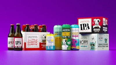
The Lagunitas Brewing Company has a history of creating hop-forward and innovative craft brews, with a quirky, inclusive style. As the company’s brewmaster says, “Lagunitas is made up of all kinds and creeds; punk rockers, misfits, ivy leaguers, weirdos, Waldos, Sparkle Ponies, musicians, and everything in between … Just a pack of stray dogs that found—despite our vast and wild differences—that the love and respect for the freedom to be different is what brought us together and made it all work.”
Unfortunately, until recently, Lagunitas’ packaging artwork was variable as its followers. Originally designed 30 years ago by the brewery’s founder in a strip-mall Kinko’s, the packaging had evolved through the years without a consistent strategy. In mid-2020, the brewery set out to create a masterbrand system that would allow for a cohesive look and feel across the portfolio. At the same time, from consumer research, it recognized that the existing packaging didn’t reflect Lagunitas’ personality or tell them much about the brews inside.
“Our packaging is arguably the most important branding and communications tool we have, so we wanted to make changes that reflect who we are and gives shoppers a sense for what they would experience if they picked up a Lagunitas brew,” says Paige Guzman, chief marketing officer for Lagunitas.
 | Read related article featuring Lagunitas, “Lagunitas, Blue Moon Test Glass ‘Flight Pack,’ or ‘Drinktainer’ Concept.” |
The new package design was done in-house and was backed by consumer input every step of the way, comprising focus groups, interviews, and quantitative research. According to Guzman, the final design is reflective of the brewery’s original—and a bit off-kilter—personality. It also works hard to help shoppers find the product, captures attention at shelf, and improves purchase intent. Says the company, “It gives consumers a better opportunity to explore the delicious, flavorful world of Lagunitas brews across different IPA styles, non-alcoholic portfolio, and newly launched Disorderly TeaHouse [spiked and sparkling tea].”
Central to the design is the Lagunitas dog, a spunky American Staffordshire Terrier of Little Rascals fame, that has been a fixture of the brand since its start and helps bring the playfulness that Lagunitas is known for. While it has always been a part of the brewery’s packaging, in the new design, it takes center stage.
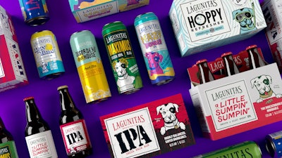 Included in the project was the packaging for Lagunitas’ brews across different IPA styles, its non-alcoholic portfolio, and its newly launched Disorderly TeaHouse spiked and sparkling tea.
Other aspects of the redesign were driven by distributor insight. For example, it calls out the ABV more clearly on all sides of the package. Due to these adjustments, Guzman explains, Lagunitas’ retail partners can better give the brand more space on shelf to create a billboard effect on its six- and 12- packs for cans and bottles, its non-alcoholic portfolio, and Disorderly TeaHouse.
The redesign spanned 100 pieces of packaging and includes the graphics for its cans, bottles, and cartons. The new design was introduced in 2022, receiving an “overwhelmingly positive” response from existing Lagunitas customers and craft brew enthusiasts.
