For food and wellness-focused company Chobani, most well-known for its Greek yogurt made from natural ingredients, package design is anything but an afterthought; it begins within a few months of the development of a new product line, with the design team working hand-in-hand with everyone from sales to marketing to ensure the design elements and creative pieces come together in a seamless way. That’s according to Chobani Creative Director Lauren Hodges, who recently spoke with Packaging World about the company’s design process, particularly as it relates to packaging graphics for a new line, Chobani Creations, and a limited-edition Halloween design.
“Our in-house creative team serves as storytellers for one simple message: provide better food to more people. We do this through type, illustration, color, and composition. Every day, we strive to reflect the same craft that goes into the food onto the packaging. To do this, we must pay special attention to the details that help communicate the products’ delicious taste and our commitment to fighting for happily ever after.
“Our packaging and product platforms are living and breathing designs. We need to make sure they stand out at the shelf through creative, eye-catching design and that the packaging meets consumer needs.”
 | Read more about Chobani's packaging design strategies in this article, "Chobani Stays on Top by Staying in Front." |
The design process for new packaging graphics begins with a brief from Chobani’s New Product Development Team, led by Chief Innovation Officer Neil Sandfort. The brief outlines the flavor, particulars about the new item, and all the specific ways the creative team can help bring it to life. To ensure that the look, feel, and functionality of new packaging graphics are all spot-on is a time-intensive process, says Hodges, often taking up to a full year, once the team takes into account testing, design, development and release. For Chobani’s most recent product line, Chobani Creations, launched in December, the timeline was even longer, as it was the first time the brand used clear plastic for the yogurt cup.
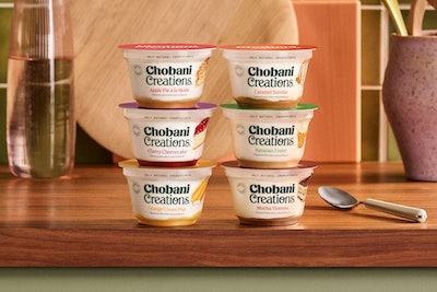
The inspiration for Chobani Creations comes from classic desserts; the yogurt contains whole milk and fruit on the bottom, offering consumers a decadent, yet wholesome, dessert alternative. “We have noticed the rising trend of permissible indulgence amongst consumers,” said Sandfort at the time of the launch. “We recognize people don’t want to eliminate their indulgences but want to enjoy them guilt-free with better-for-you ingredients. That is why we launched Chobani Creations in six nostalgic fan-favorite flavors like sweet orange cream pop or a warm apple pie crafted with only natural and thoughtful ingredients.”
Packaging graphics convey permissable indulgence
Chobani’s in-house data team and R&D provided insights that drove the design strategy for the packaging graphics, which hinged on that promise of permissible indulgence. The in-house creative team led the design, with outside contributions from Commercial Type for the typeface and illustrations drawn by Meryl Rowin.
Packaging graphics for the Chobani Creations cup include the same illustration style as found on Chobani’s classic Greek yogurt packaging, but emphasize the line’s nostalgic flavor profiles. “We paired those designs with full-flooded, colored lids and an enchanted swash serif logotype to evoke the feeling of a magical bake shop,” says Hodges. “The allure is compounded by the new packaging itself. Seen through the clear cup, the product creates a backdrop of naturally beautiful waves of food on the bottom that blend into varying elevations of flavored creamy Greek yogurt throughout.”
 | Read this story to learn how Chobani is dipping its toes into the paper packaging trend. |
Chobani Creations represents the first new line introduced by the brand since the launch of Chobani Zero Sugar in 2021, but it’s not the first new packaging the creative team has designed since then. Among its more recent projects, the team developed interactive Halloween packaging for multipacks of Chobani Flip. The Halloween overwraps were “the first of many seasonal packaging takeovers Chobani is planning for its various Greek yogurt platforms,” the company noted at the time of the launch.
Outside experts enhance packaging graphics
Packaging for both Chobani Creations and the Halloween multipacks exemplify Chobani’s willingness to bring in outside resources when needed. Explains Hodges, “We have a really special, robust team that is continuing to evolve to meet the needs of today’s consumers, but we also look outside ourselves to external partners who add their specific touch to our projects on a case by case basis. A recent example was when we brought in Tool of North America for their specialized AR [augmented reality] expertise ahead of our Halloween Flip campaign.”
 The Chobani design team recently created new packaging graphics for limited-time Halloween overwraps.
Through its in-house design team and outside partners, Chobani continuously strives to bring to market the best of its brand, Hodges shares. “Since packaging is a high-priority touchpoint with the consumer, the creative team takes immense pride and applied precision to each item and innovation we are tasked with.” PW
